
With nearly countless UI kits available today, the leadership competition happens as Google’s Material Design vs Shadcn/UI. The former established itself as a go-to UI kit in 2014, as it follows all the Google guidelines, provides consistency in the interface design, and has nearly anything a web interface may need. The latter is an emerging star that has gained popularity in recent years and promises to stay on top for long.
But how to choose between Shadcn/UI and material design for the product or the project to make the most of it?
Clearly, the choice depends on your needs in the project and other variables in it. Django Stars’ case studies vary in purpose and scale: from a new approach to a diving travel experience to creating a digital experience for mortgages in quite a conservative market. Our UI/UX team has extensive experience with a variety of systems and knows how to build an effective design system for a particular case.
Now, let’s overview the features Shadcn/UI and material design have and compare them to see which choice will be better depending on the nature of the project.
Key Takeaways
- In the comparison between the two, Material Design UI is a more established system, hence it has documentation for virtually any case and is backed by a large online community sharing experiences and tips related to the system. At the same time, Shadcn/UI is a new open-source collection that is quickly gaining popularity.
- Shadcn/UI is a modular system that allows working with each component individually.
- The main benefits that come with Shadcn/UI are its ease of use, accessibility, and scalability, while MUI is known for its consistency, uniformity, extensive editing options, and vast community online.
- The choice of design system depends on the project’s requirements and cannot be taken without thoroughly researching its context.
| Shadcn/UI | MUI (Material Design) | |
|---|---|---|
| Design System | No design system | Google’s Material Design |
| Approach | Build your own component library from scratch | Component library |
| Styling Approach | Tailwind CSS | Emotion/styled -components |
| Customization and Theming | Full customization control. Copy and paste code into your project and customize. | Bundle installation of component collections. |
| Platform Support | Mostly web-focused | Web, iOS, Android friendly |
| Community and Documentation | Expanding and lively community | Large and active community; detailed documentation |
| Pricing | Open-source | Fee-based installation of UI kits |
| Learning Curve and Implementation | Coding, frameworks | Coding frameworks, MUI design system |
| Maintainability | Since the component code becomes part of the product's source code, it will require attention and consideration as your product grows. | A UI package encapsulating all the logic accommodates growth and changes in the product more smoothly. |
| Suitable Projects | Internal and smaller-scale web products | Middle and large-scale products |
Shadcn/UI
Although it is listed in all charts and used by developers as one of the now countless UI libraries, Shadcn/UI’s documentation defines it as a collection of reusable components one can copy and paste into their application. Thus, the key comparison point about Shadcn/UI vs Material UI or any other traditional component library is the format of components it provides.
It was only released in 2023, and it is already one of the undeniable design trends and a top selection for experienced developers due to its features and benefits that come along.
Shadcn/UI Key Features
Customization of Components
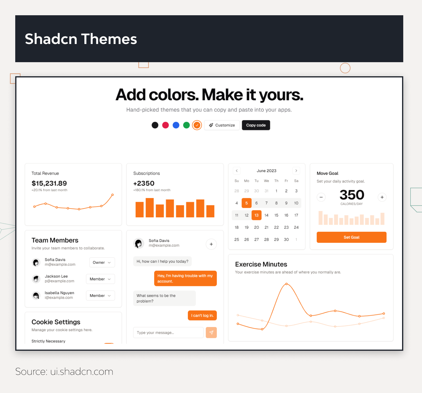
The platform allows for component-based development and modular UI design, as it provides the component as a code rather than a file. It is also possible to obtain a theme as a bundle, and it is possible to customize it as a code or use Shadcn/UI’s theme editor instead.
Modularity
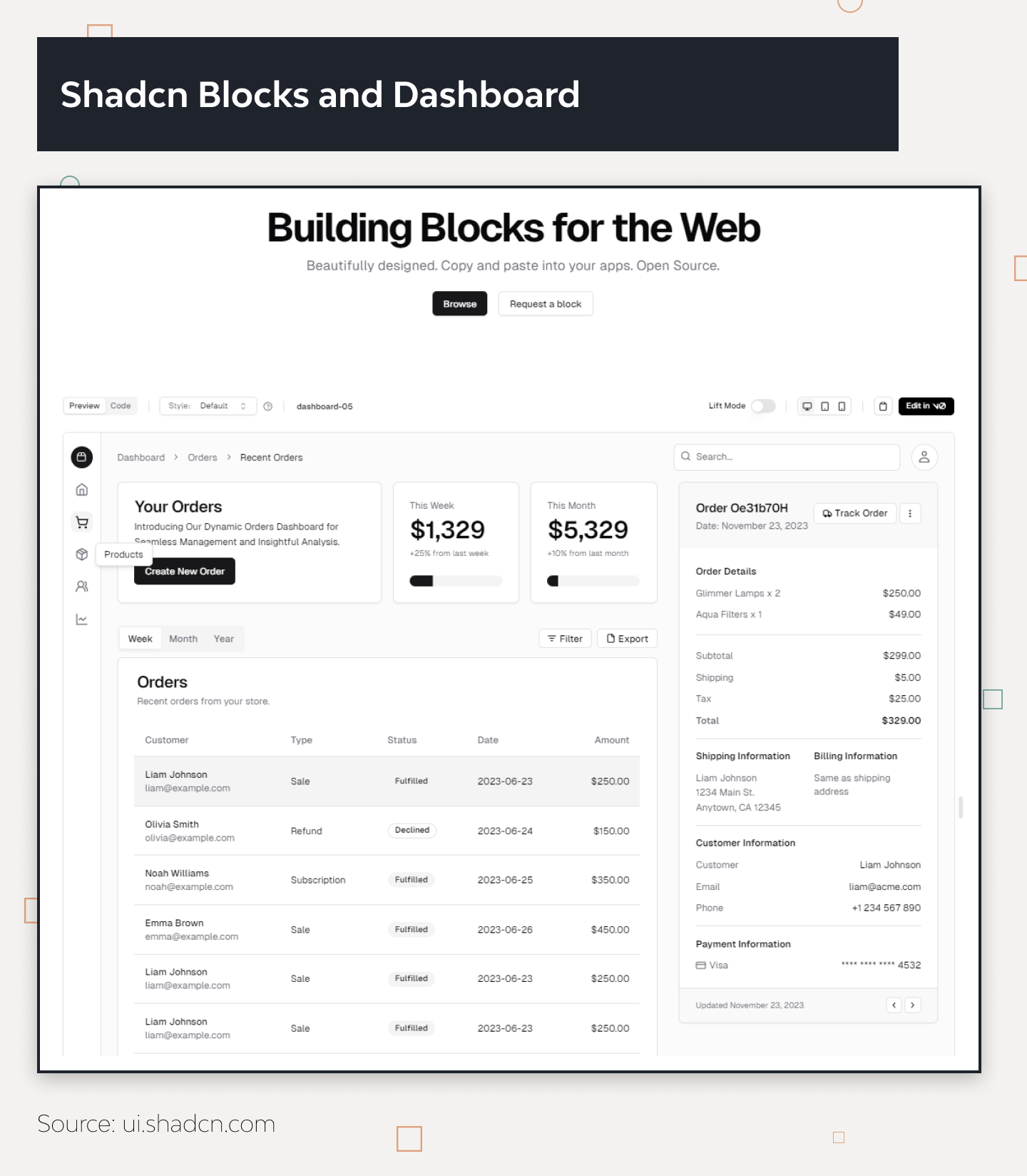
The platform allows the developer team to simply copy and paste the needed Shadcn components as code instead of piling them in an npm package first. Its component-based structure gives developers ownership and detailed control over the component library in the product. Thus, it provides tools to mold and style the components to the preferences and needs of the product.
Performance Optimization
Shadcn/UI’s modular approach helps with performance optimization, as the team can choose only the components it needs and work with them as code, which elevates consistency and provides smoother user experiences at the same time.
Benefits of Shadcn/UI
Teams who have worked with Shadcn/UI highlight its ease of use, accessibility, and scalability. Basic knowledge of HTML, CSS, or JavaScript, plus a framework like Shadcn vue application is enough to grasp working this component collection.
Its components are fully accessible and adhere to Web Content Accessibility Guidelines. Shadcn/UI allows working screen readers and keyboard navigation, providing everything for creating aesthetically pleasing and accessible software. Finally, developers have direct access to each component’s source code, so the only limitation in customization is the developer’s skill rather than the features it has.
Shadcn/UI Shortcomings
Although working on every individual component’s code gives more customization options, copying or installing each element may turn out bothersome at times. On a project with tight deadlines, it can be a complication or a source of stress, especially while working with the entire component package. Also, working with design elements as a code means a larger codebase, which will mean more resources for maintenance in the future.
Takeaway by DjangoStars
For the products that do not project drastic transformation in the long run and the projects with tight deadlines, it is optimal to go for Shadcn compared to Material UI. Incorporating individual elements one by one simply makes more sense than dedicating a significant time to working with a big UI kit as a whole, especially if the product does not need all its contents.
Material Design (MUI)
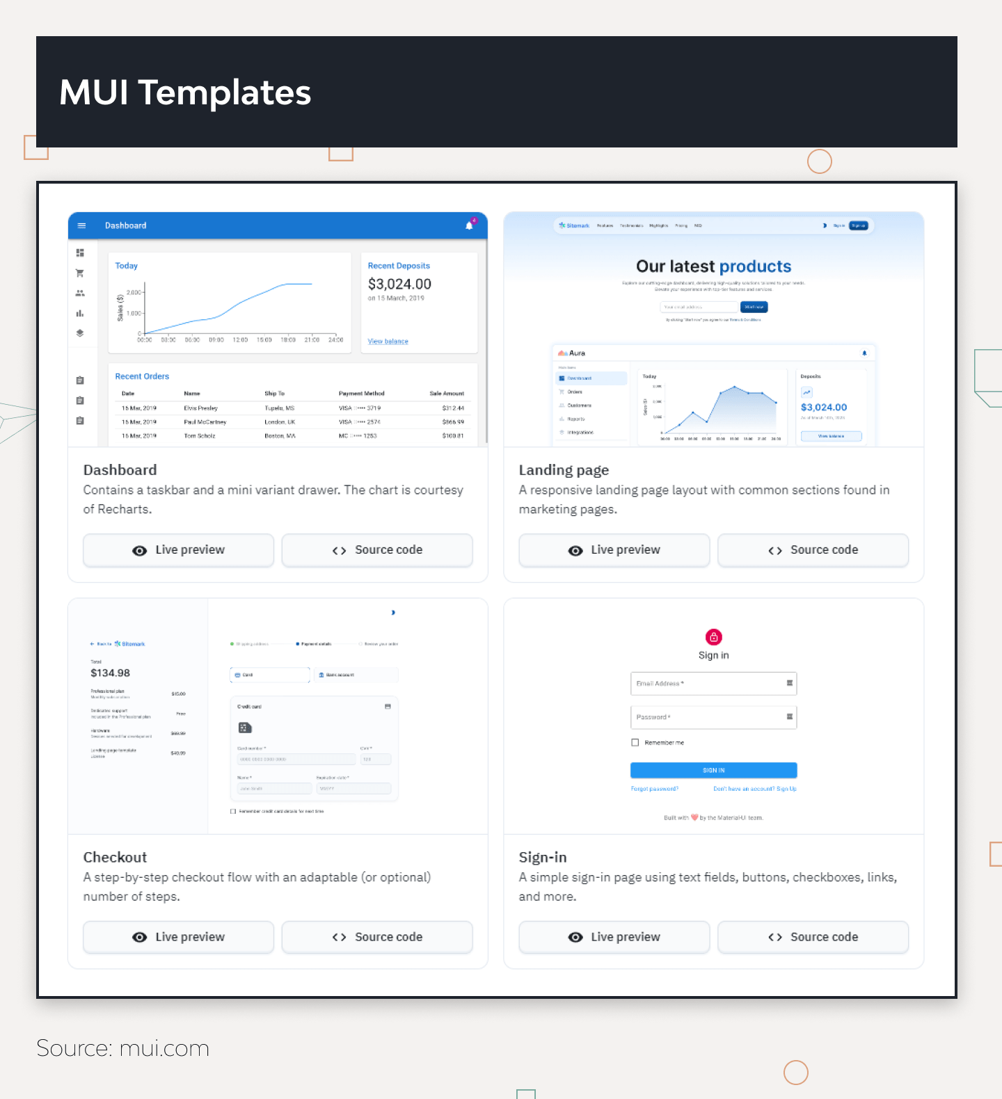
While one can install Shadcn components individually, Material Design comes in packages. Now referred to as simply MUI, it is a design system by Google, inspired by its card-based layout. MUI has a visual guide for user interactions and motion, which developers can customize to the project and implement on different devices and platforms.
MUI is also generally referenced as a UI component library, but since it was developed by Google itself, there is an entire philosophy behind it. The Material Design approach is built on these core principles:
| #1 Material is the metaphor. | The whole system is built on the metaphor of physical materials, providing the users with familiar visual elements from real life and thus hinting at how to interact with the product. It offers elements like shadows, depth, and motion to create a sense of tactility and realism in digital interfaces. |
|---|---|
| #2 Bold, graphic, and intentional. | Google leads by example and encourages teams to use bold colors, typography, and imagery. It helps to create engaging and memorable experiences and encourages designers to use strong visual hierarchy and deliberate design choices, which also provides a smoother user experience. |
| #3 Motion provides meaning. | Motion is used intentionally. The system encourages the use of motion to convey meaning, gUIde as an additional means to clarify relationships between elements in the visual hierarchy and to create seamless transitions. |
| #4 Respond and adapt. | MUI promotes responsive and adaptive design principles to ensure that interfaces are usable and visually appealing across a wide range of screen sizes and devices. |
| #5 User actions in the focus. | MUI focuses on the user's actions and interactions to plan or perfect its features. The main priority for the system is a smooth user experience, which is achieved through clear and intuitive navigation, feedback mechanisms, and interactive elements. |

Post a Comment